


In the fast-paced digital era we find ourselves in, the need for businesses to adapt and keep up with technological advancements has become more critical than ever before. One such advancement that has revolutionized the way we browse the internet is responsive web design. Gone are the days of zooming in and struggling to navigate each website on our mobile devices. With the emergence of responsive web design, businesses now have the power to provide a seamless and user-friendly experience across all devices. In this article, we will delve into five factors that make responsive web design an essential component for businesses striving to thrive in today’s digital landscape. Strap in and get ready to explore the world of responsive web design!
Responsive web design has become a fundamental aspect for businesses in the digital age. With the rise of smartphones and tablets, having a website that adapts seamlessly to different screen sizes is crucial. The benefits of responsive design extend far beyond aesthetics – they encompass user experience, SEO rankings, and even conversion rates.
One of the key advantages of responsive web design is improved user experience. Rather than having a separate mobile site, responsive design allows for a cohesive user experience across all devices. This means that whether your customers are accessing your website on a desktop computer, a tablet, or a smartphone, they will have a consistent and user-friendly interface. This enhanced experience translates into increased engagement and lower bounce rates, as users are more likely to stay on your site and navigate through its content.
Another compelling reason for businesses to prioritize responsive web design is its impact on search engine optimization (SEO). Search engines, like Google, favor websites that provide a seamless browsing experience across different devices. By having a responsive website, you increase your chances of ranking higher in search engine results pages. Additionally, having a single URL for your website makes it easier for search engine bots to crawl and index your content, leading to better visibility and organic traffic. This, in turn, can result in higher conversion rates and ultimately boost your business’s success.
Creating a seamless user experience across devices is paramount in today’s digital world. With the increasing number of technology platforms, it is important for businesses to ensure that users can effortlessly transition between devices while still enjoying a consistent and engaging experience.
One way to enhance user experience across devices is by adopting a responsive design approach. This means designing and developing websites or applications that automatically adjust to different screen sizes and resolutions. By utilizing HTML5 and CSS3, developers can create fluid layouts that adapt to various devices, whether it’s a desktop computer, tablet, or smartphone.
By following these principles, businesses can ensure that users have a seamless experience across all their devices. Whether it’s browsing a website, using a mobile app, or interacting with an IoT device, a consistent and optimized user experience is key to keeping users engaged, happy, and loyal.
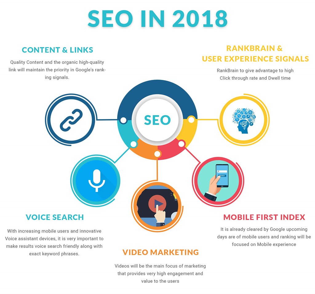
When it comes to enhancing your website’s search engine optimization (SEO) and increasing its visibility, there are several tried-and-tested strategies that can help you climb the ranks in search engine results pages. By implementing these effective tactics, you can attract more organic traffic and reach a wider audience.
These are just a few strategies to improve your website’s SEO and visibility. By investing time and effort into implementing these tactics, you can significantly boost your website’s ranking and attract more visitors who could potentially convert into loyal customers.

One of the key recommendations for successfully implementing responsive web design is to prioritize mobile-first development. When crafting your website, it is crucial to put mobile devices at the forefront of your design strategy. This means considering the limitations and unique features of mobile devices and tailoring your website’s layout and functionality to provide an optimal user experience for mobile users. By starting with a mobile-first approach, you ensure that your website is user-friendly and visually appealing on smaller screens, while still being able to scale up seamlessly for larger devices.
Another important recommendation is to use fluid grids and flexible images. Fluid grids allow your website’s layout to adapt and resize proportionally to fit different screen sizes. This dynamic design approach ensures that your content is displayed in a visually appealing and legible manner across a wide range of devices. Additionally, incorporating flexible images into your responsive web design helps prevent images from overflowing or getting cropped on smaller screens. By using HTML and CSS techniques such as `max-width: 100%`, you can ensure that images automatically adjust their size to fit the available space on various devices, improving the overall responsiveness of your website. Remember, a well-executed responsive design doesn’t just fit the content to the screen; it enhances the user experience and ensures your website stays accessible and engaging for all users, regardless of the device they’re using.
In a world where digital presence is paramount, businesses must constantly adapt to the ever-changing landscape of technology. One of the most vital aspects of a successful online strategy is responsive web design. We’ve explored five critical factors that make it an absolute necessity for businesses in today’s digital age.
Factor #1: User Experience. With an increasing number of users accessing websites through mobile devices, a responsive web design ensures seamless navigation and optimal user experience regardless of the screen size. By eliminating frustrating zooming and scrolling, businesses can captivate and retain their audience, leading to higher customer engagement and conversions.
Factor #2: Search Engine Optimization (SEO). To climb the ranks of search engine results pages, businesses must prioritize responsive web design. Search engines like Google strongly favor mobile-friendly websites, making it essential for businesses to invest in this aspect. By improving SEO, businesses can increase their online visibility and attract targeted traffic, ultimately boosting their overall digital presence.
Factor #3: Accessibility and Compatibility. The beauty of responsive web design lies in its ability to adapt to various devices seamlessly. By ensuring compatibility with a wide range of browsers and operating systems, businesses can reach a broader audience, including those with disabilities. Inclusivity and accessibility go hand in hand with responsive design, underlining its importance in creating a user-friendly and universally accessible web experience.
Factor #4: Faster Loading Times. As attention spans continue to dwindle, businesses cannot afford slow-loading websites. Responsive web design optimizes loading times, ensuring visitors don’t lose interest or patience. Users appreciate speed and efficiency, and businesses that invest in responsive design will undoubtedly reap the rewards of improved visitor engagement and lower bounce rates.
Factor #5: Cost-Effectiveness. Building separate websites for desktop and mobile devices can be a costly affair. Responsive web design eliminates the need for multiple sites, saving businesses both time and money. Moreover, maintaining a single website is far more manageable, providing consistent and streamlined branding across all devices.
As the digital world evolves, businesses must stay ahead of the curve to remain competitive. Responsive web design serves as the foundation for success, offering seamless navigation, improved SEO, wider accessibility, faster loading times, and cost-effectiveness. By embracing this essential factor, businesses not only future-proof their online presence but also open doors to new opportunities and growth. So, if you want to stay relevant and thrive in the digital landscape, responsive web design is the key to unlocking endless possibilities.

